
This is the third and last part of the AI Audit Pipeline series. Every audit Claude Code runs leaves a CSV behind, and in this video we turn all of them into an interactive Power BI dashboard: the health of every model at a glance, how the project has been evolving week by week, and the best part, it updates itself when a new audit comes in.
The AI Audit Pipeline
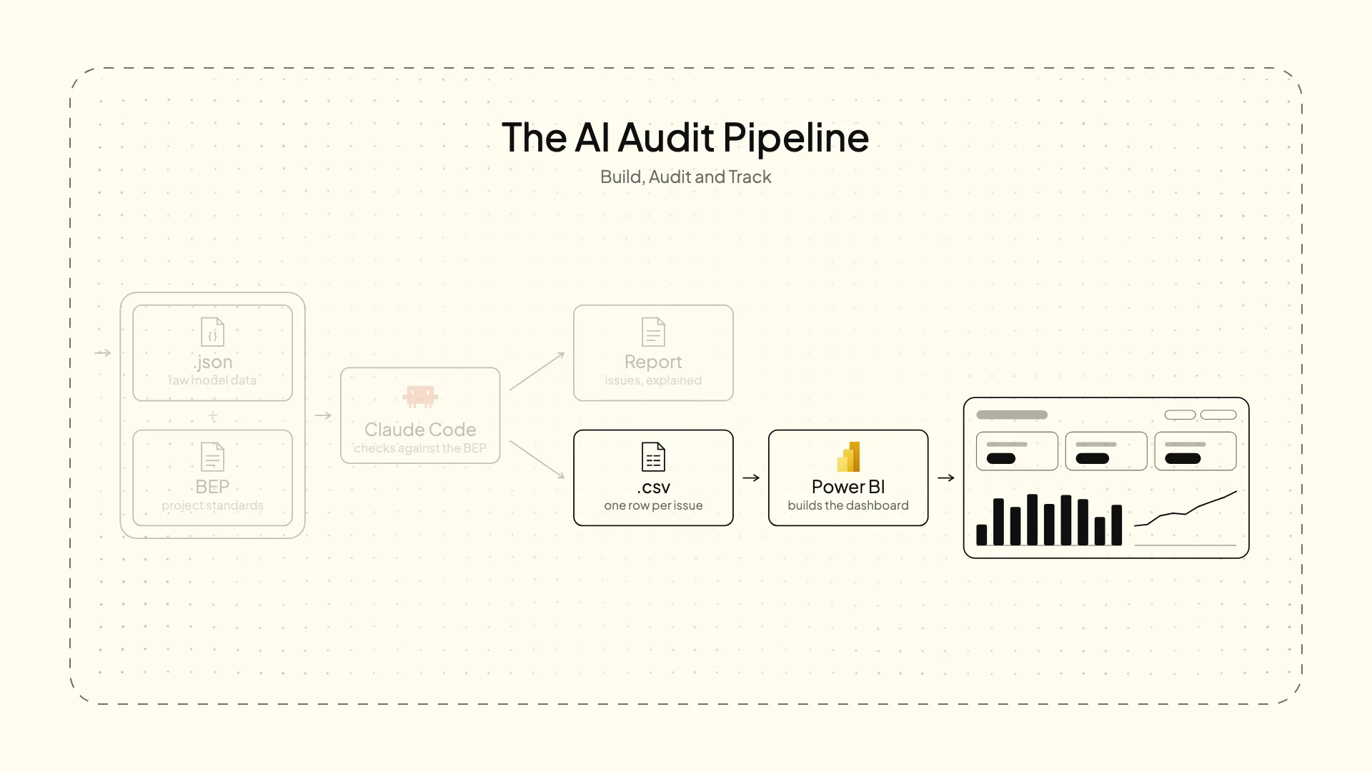
In the first part a pyRevit button extracted the state of the models to a JSON. In the second, Claude Code checked it against the BIM Execution Plan and gave us two outputs: a report for people, and a CSV for this dashboard.
The data
One CSV per week, from week 1 to 38. Each one has 77 rows: 11 checks for each of the 7 models.
| Column | What it holds |
|---|---|
week | The week the audit was run |
model | The model the row is about |
check_id | The check, with its ID from the audit template |
status | PASS, WARN or FAIL |
value | What was measured: 47 warnings, a size in MB, a distance in metres… |
label | What that value is |
threshold | The contractual limit from the BEP. It doesn’t change during the project |
issues | How many things need fixing |
Why the AI is in the middleThis CSV couldn’t be extracted straight from the models. Several checks need interpretation, human or, in this case, by AI.
Loading a folder, not a file
The source in Power BI is the folder, not a file: Get data → Folder → Combine & Transform Data. That’s what makes the dashboard cumulative. Every audit that lands in the folder becomes part of the history.
In Power Query, a few things that are easy to get wrong:
- Do not detect data types when combining, and set the types yourself afterwards.
valueandthresholdas Decimal Number with Using Locale → English (United States), so the decimal points are read correctly.valueandthresholdset to Don’t summarize. That column mixes megabytes, metres, warnings and percentages. Adding them up gives a number that means absolutely nothing.
The data model
Next to the audits, two small tables typed in by hand with Enter data:
modelstranslates the file name into a readable discipline (“Snowdon Towers Sample Architectural” → “Architecture”) and sets the order the disciplines appear in.checkstranslates the ID into a readable name (“NAM-08” → “Sheets not following naming”) and groups each check into its category, with its order.
As long as the names match the CSV exactly, Power BI creates the relationships on its own.
The AI writes the data, you set the frameThe audit CSV changes every week, and the AI writes it. The auxiliary tables are fixed, and you decide them. That’s what keeps you in control of what the dashboard says.
Health Score
The number that tells you whether the project is going well. There are several ways to get to it. Here, anything that isn’t a PASS counts against it: the percentage of checks that pass in the latest week.
Health Score =
VAR LastWeek = MAX ( audits[week] )
RETURN
DIVIDE (
    CALCULATE ( COUNTROWS ( audits ), audits[status] = "PASS", audits[week] = LastWeek ) + 0,
    CALCULATE ( COUNTROWS ( audits ), audits[week] = LastWeek )
)
That + 0 matters more than it looks: it turns an empty result into a zero. Without it, a category with no PASS at all disappears from the charts. Exactly the worst ones.
And MAX ( audits[week] ) works in both places: on a card it’s the latest week, and on a chart by week it’s the week of each point. The same measure feeds both.
Compared with last week
A number on its own says little. Whether it went up or down since last week says a lot more.
Health Score Change =
VAR LastWeek = MAX ( audits[week] )
VAR PrevWeek = CALCULATE ( MAX ( audits[week] ), audits[week] < LastWeek )
VAR ScoreNow = [Health Score]
VAR ScorePrev = CALCULATE ( [Health Score], audits[week] = PrevWeek )
RETURN
IF ( NOT ISBLANK ( PrevWeek ), ScoreNow - ScorePrev )
It’s a subtraction. The only tricky part is finding last week: out of all the weeks before the current one, keep the highest. The same pattern, a value plus its change, repeats for checks passed, checks failed, total issues and the size of the largest model.
The dashboard
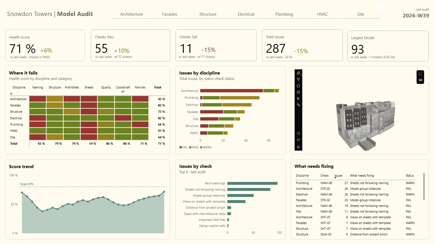
Each visual answers one question:
- KPI cards. How is the project this week, and better or worse than last?
- Score trend. Where is it heading? A line with the Health Score for every week, sorted by
week, not by value. - Matrix, discipline × category. Where does it fail? Health Score as a colour gradient, so a problem in Naming in Architecture jumps out at a glance.
- Issues by model and by check. The same issues from two angles: who has them, and what kind they are.
- What needs fixing. A table with only the FAILs and WARNs of the latest week.
That table needs one more measure, because on its own it adds up the rows of every week:
Is Last Week =
IF (
    MAX ( audits[week] ) = CALCULATE ( MAX ( audits[week] ), ALL ( audits ) ),
    1
)
Drag it into the visual’s filters and choose is 1.
A colour always means the sameIn the matrix and the bars, fix the gradient with numbers (0, 0.5, 1) instead of “lowest” and “highest value”. That way red is always red, whatever the week.
IFC viewer
To see the model itself inside the report, there’s a free IFC viewer visual in the Microsoft Marketplace. Drop the IFC in its folder and it shows up. Handy for coordination meetings, and nobody needs a Revit licence to look at it.
Conclusion
The real test is a new audit. Week 39 goes into the folder, Refresh, and a few seconds later the score, the trend and every chart include it. In the real workflow Claude Code writes that CSV straight into the folder, so nobody has to touch the dashboard.
That closes the series. A pyRevit button extracts, the BEP sets the limits, Claude Code interprets, and Power BI keeps the history. Each tool does one job, none depends on the others, and together they turn a model audit from an afternoon of clicking into something you can check every week.